8 steps to perfect screenshots of your app
Creating an app is just the tip of the iceberg. Now comes basically the most difficult stage – you have to encourage users to download the app from the stores. Here everything matters. Name, description, icon and screenshots. And it is on the graphic elements that most depends.
Sometimes aesthetically pleasing, careful visual presentation of an app is more effective than advertising it. It is also worth remembering that at the moment there are a whole multitude of applications with twin functionalities and sometimes it is difficult to add something new. So how to stand out from the competition?
Just with the help of appropriate graphics. Here are 8 tips to take care of the visual presentation of your app.
1. Adjust the size and quality of the screens
Trivial, but how important. When a user browses the store on their smartphone or tablet, they want to preview how the app will look on their device. Therefore, the image it will display should be sized as best as possible for the resolution of its display. This is clearly and transparently explained in the iTunes Connect Developer Guide, including the various resolutions you should adhere to.
For creating screenshots for Android, it’s worth taking a look here.
Remember also about the quality and format of graphics. As screencaps, upload high-quality graphics, preferably in JPG or PNG format.
2. Use the whole pool of images
In the App Store, you have five images available. In Google Play – eight. Uploading one screen shot is the bare minimum necessary. But why limit yourself?
More images give you more opportunities to show the user why your application is worthy of attention. This way you can show the app’s strengths, as well as guide the user step by step through its most important functions.
3. Take advantage of graphic editing capabilities
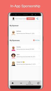
“Dry” screenshots are needed. However, once you have these 5-8 images to use, you can play with the form a bit and improve the screenshots. You can include a graphic showing the screen on the device (you can take an actual photo or use many ready-made mock-ups, provided even by Apple itself), adding also a nice blurred background and a caption describing the function. You can take a photo showing the practical use of the app.
You can add clouds and subtitles to the app’s screenshot. You can show the screen from an angle, adding various effects to it The possibilities are many, take advantage of them! At the same time, however, remember that less is more.
For detailed instructions on how to make interesting screenshots, see e.g. here.
4. Show the app in use
Among the screens, it’s worth presenting those screens that the user will deal with most often – simply to show him that your app is nice and pleasant to use.
5. Make a mini-tutorial
Uploaded images don’t have to be dry screenshots alone. It’s worth going a step further and giving clues to the key functions of the application, highlighting its significant elements. Also, using an actual photo of the device with the application turned on, you can easily show the gestural operation of the application or its use.
Arrows, circles, pictures of the device placed in life-like contexts – all of these indicate the functionality of the app (and the effort you put into properly preparing the presentation of the app in the store).
6. Describe the screenshots clearly and sparingly
1-2 lines of text per screen is the maximum. Limit yourself to a minimum of characters and a maximum of content. It is good to put a caption above the screen so that viewers can easily distinguish the description from the content of the app.
7. Present the latest features
Don’t forget about updates. If an important new functionality has appeared in your application, do not forget to include it in screenshots. It’s worth including a screenshot showing the new feature as the first default graphic.

